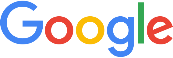
Shocking news this morning, as Google revealed its new corporate logo.
The new Google logo inherits the same colors per letter, and gets rid of the serifs it used for years.

It also changes its little “g” icon, replacing with a four color “G”.
The font family appears to be Relish Pro, according to a first look. The “e” has a more prominent angle, however.
It’s not as if Google isn’t a huge brand already, it’s about getting on with the times. Yahoo did the same, and although the result was weaker, in my opinion, everyone still recognizes the brand.
It’s important to keep in mind that while many popular brands use strictly a stylized font for their brands, to achieve a distinct result – such as the Coca-Cola logotype – more complex elements need to be introduced.
Personally, I think the new Google logo is cleaner looking, more “fun” and it gives Google the ability to brand its services in a bolder manner.

Interesting. Have been doing some side-by-side comparisons just now.
I do miss having 4 circles in the “oog”. The new middle “g” has only 1 now. But the uniform width brings out that shape in the big “G” and “e”. Everything’s a circle now, in fact, except 1 vertical line.
In some older versions that final “e” looked like a laughing face. Now it squints.
I like the attempt at simplicity, but the G looks like the one from Green Bay and the E from internet explorer.
The angled ‘e’ isn’t an IE exclusive 😉 Also, certain fonts trend in use, and there are several distinct font families that share similar designs, as a whole or in part. The subtle differences can give a distinct character to a logo design.
I think the second “g” (the lowercase “g”) looks a little squished and the “gait” of the lower tail of the “g” could be done a little bigger and better. But just one man’s opinion.