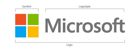
Microsoft corporation has changed its logo after a quarter of a century; this is going to be discussed in the coming months, more – in my opinion – than Bill Gates’ departure from the company.

The new Microsoft logo.
There was nothing inherently wrong with the previous logo. It was single-colored, had a stylized font with a nice, aggressive “OS” letter pair that apparently symbolized the words “operating system”.
But now that Microsoft is launching Windows 8 and their colorful, “metro” look in October, the 25 year old logo seemed to be in need of a new coat of paint.
Change is always good, but is the new logo efficient and worthy of representing Microsoft’s legacy and history?
The Segoe font type is definitely crispy; after all, Microsoft is using it in all of its current products. The gray tones of the lettering stand out against both white and black, without the need for a color substitution. The same goes for the four-square window, that’s representative of the primary Microsoft product: Windows.
I’ve an objection to the colors used in the four-square symbol: it seems that they’ve been used already by a myriad other companies in various shapes, including the Google Chrome browser. I would expect Microsoft to build a different palette of colors, simply to distinguish itself.
Is there anything ugly in this new rollout?
Apparently, Microsoft did not consider to launch a more “aggressive” campaign for their new logo, and the domain name MicrosoftLogo.com remains unregistered as of this post.
Edit: Someone actually went ahead and registered the domain; I pity the foo’!

I can boil it down to one word……
BORING!
What’s worse……
They had 50 meetings, 500 sub-meetings and actually PAID somebody to come up with this new, innovative and clever design. NOT!
Then they all had to approve it!
Rick, TGIF!
It’s not as bad as the Windows 8 logo in its February 2012 incarnation. I’ve only found one source stating that the Windows 8 logo has been redesigned as well, but no images. They have a huge stash of trademarks under their command: http://www.microsoft.com/About/Legal/EN/US/IntellectualProperty/Trademarks/EN-US.aspx
It is quite hard to believe that Microsoft probably paid around $500,000+ to get this new logo (according to one video I watched anyway).
I think we’ll see a lot more brands/companies coming up with simpler logos in the next few years, don’t know if that’s a good thing or a bad thing though!